Basic Logo Elements

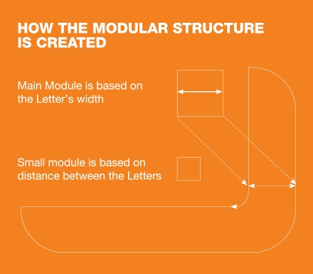
BASIC ELEMENTS MODULAR STRUCTURE
The logo is built using a modular structure. This gives us a flexible format with enough space around the logo to make it distinct & noticeable.
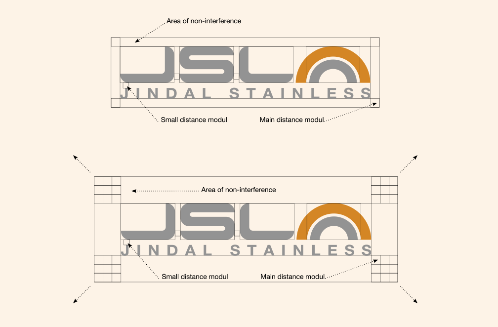
CLEAR SPACE
For legibility and impact, avoid putting any text or graphics within one ‘main module’ distance on all sides. An exception to this is online where our logo can be presented with less clear space. However, always ensure it is legible.
MINIMUM SIZE
The minimum size may vary depending on the process or materials used. Please carry out reproduction testing where necessary to establish the right size for your use.
BASIC ELEMENTS CLEARSPACE
Area of non-interference increases proportionally.
Just multiply the modules as needed
BASIC ELEMENTS SIZE
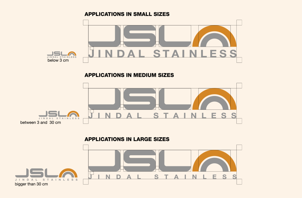
One Logo. Three Different Sizes.
There are three ways to represent the Jindal Stainless Group Logo.
This is to maintain a clearly visible wordmark i.e Jindal Stainless
BASIC ELEMENTS LOGO WITH BACKGROUNDS
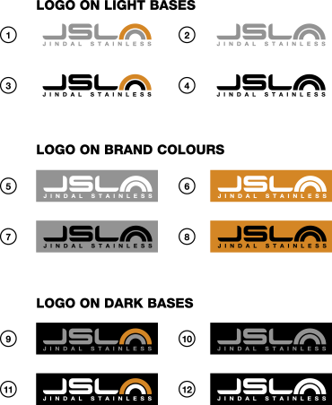
LOGO ON LIGHT BASES
1. 2. 3. 4. Use on light bases.
For B/W documents use 2. 3.
LOGO ON BRAND COLOURS
5. 6. 7. 8. Use with Jindal Stainless colours backgrounds
Usage of black or white option depend on design porpouse
LOGO ON DARK BASES
9. 10. 11. 12. Use with dark bases
For B/W documents use 10. 12.
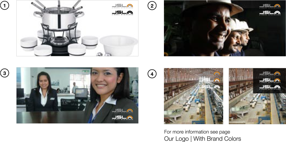
BASIC ELEMENTS LOGO WITH PICTURES
LOGO HAS TO BE VISIBLE!
- Use logo as on picture #1 if your background is white or very light
- Use logo as on picture #2 if your background is black or very dark
- Use logo as on picture #3 if your background is gray or neutral
- Avoid using logo on any cluttered background as shown in 4a.
Use a solid background
CMYK: 0/0/0/100 | Transparency: Multiply Mode @ 80% as in picture #4
